The Square Deus Ex
Published on Oct 26, 2023
Earlier this year, after being drawn in by a sale on GOG, I decided it might be fun to fill in some of the gaps in my experience with the history of PC games. And, hot on the heels of an as-yet unfinished first playthrough of the original System Shock, I thought it sounded fun to play through the entire series of Deus Ex games.
I’d played half of the series in college (The original and Human Revolution), so I already knew I loved these games, and that this “challenge” shouldn’t end up feeling like a slog.
I had also originally planned to finish the series before the release of Cyberpunk 2077’s big 2.0 patch, and then experience that game for the first time in the context of a series that feels at least thematically similar, to see if anything came of that. That didn’t end up happening, partly because I was having such a great time playing Deus Ex games that I took too long! But I digress.
My journey through the series began, sort of accidentally, with 2011’s Deus Ex: Human Revolution. I had originally intended to play through the series in release order starting with the original Deus Ex, but two of my greatest flaws/fixations, nostalgia and tinkering with weird technical issues, conspired against me. However, this way of playing the series sort of also makes sense, because Human Revolution and its sequel are both prequels to the original game, so I guess I’m playing the games in timeline order now. Oops!
Anyhow, as I played my way through Human Revolution, I was struck by just how much I love the way this game looks. DXHR has such a unique, bespoke, and in my opinion, iconic art style that perfectly suits the corporate, dystopian, and technological themes of its world, and that, thinking back, has been a big part of my love for this game since its release.
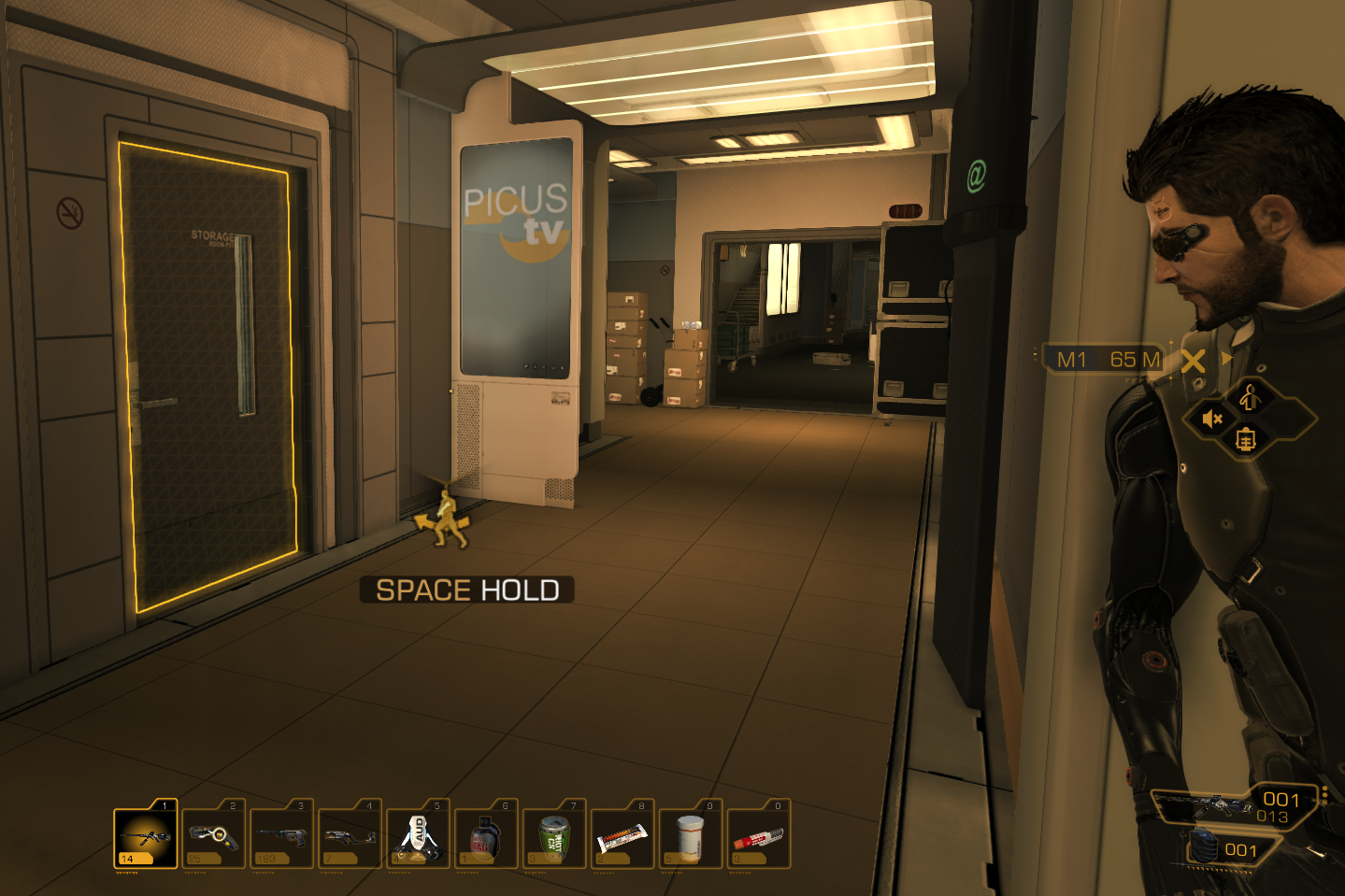
Even moreso than the game’s signature gold tint, what sticks out to me as Human Revolution’s signature style is just how square everything is. This comes through most strikingly in the architecture and design of DXHR’s spaces, with lots of sharp angles, clean lines, and flat surfaces.

The sharp, angular offices of the Sarif Industries building.

Everything looks like it’s made of hard plastic sheets.

Even the train stations are clean and stark.
Every surface in a given space, from the floors and walls to the desks, boxes, crates, shelves, air conditioning units, and just about every other piece of set dressing you can set your sights on, is squared off, flat and clean. Everything ends up looking neat and orderly, even when a given area is supposed to be in shambles.

Cover up that fire with your finger, and that’s a very orderly little loading dock.

Even the obvious repetition of assets feeds into the clean, square aesthetic.
It isn’t just the design and shape language that makes the game feel this way, it’s also the lighting. Spaces and objects in Human Revolution all seem to be lit rather flatly and evenly. There’s very little contrast (at least at default settings), which is actually quite useful in a game in which you spend much of your time skulking in the shadows.
Every surface ends up looking like a hard, matte plastic material, which almost makes it feel like you’re playing with a bunch of action figures inside a massive playset. This not only adds to the square, stark, corporate feeling, it also (in my experience) renders all of the game’s environments eminently readable.

A very flat looking office plaza.

A very clean looking escalator.
Even the UI carries through this look of square or square-ish shapes with barely-rounded and often cut-off corners. In addition to generally tying everything together and helping it all feel cohesive and whole, this also makes every element of the UI feel neat and organized.
Even the game’s upgrade screen, which is too often rendered as the dreaded Skill Tree in other games, is instead presented as an orderly grid of squares organized by which part of the body they modify. Keeping with the flat design motif, all of the upgrades are available to choose immediately, rather than having some gated behind others, tree-style.

A place for everything, and everything in its place.

I mean, it was 2011, Windows Metro had just happened.
You spend a lot of time in Human Revolution exploring modern, corporate spaces, so it makes a lot of sense that the game would lean into this style of presenting its world. I’m just struck every time I re-play the game by how hard the dev team actually leaned in. It’s admirable, I think, and refreshing to see in the context of a modern games landscape filled with HDR, Ray-Tracing, and a fanatical desire for “realism” that just results in every game looking the same.
Granted, none of these techniques were in wide use, or largely even possible, in the time Human Revolution was released, but I think the point stands.

It’s all boxes, man.
This firm adherence to a distinct visual style also goes a long way toward setting the game’s tone and mood. The flat, even lighting remains a constant in exterior locations, where it always seems to be night. Leaning hard into this aesthetic seems a bit grimdark edgelord at first, but much like the original Deus Ex, which didn’t actually believe any of the conspiracy theories it was playing with, if you look a little harder, you’ll see the ways that this overarching, unrelenting style actually keeps things light and acknowledges that Deus Ex is goofy, and doesn’t have to take itself too seriously.
It’s not a comedy, and not exactly a satire, but it knows it’s fiction, it knows it’s a video game, and it’s not going to try and pretend otherwise in a pointless quest for realism.

It just always looks like this.

Does Jensen sleep during the day or something?
At its best, Deus Ex is all about offering up different styles of play and allowing the player to go all-in on exactly what they want. That doesn’t mean building an infinite open world and allowing you to climb every mountain, it just means building out expansive possibility spaces that allow the player to progress through the game’s authored, linear story and world in the way that they so choose.
It’s really cool that the folks making Human Revolution understood that, and realized that that allowed them the freedom to go ham on an honest-to-goodness art style in every single nook and cranny of the game. I didn’t even talk about the clothing!
Maybe it’s just that this game is from an era when big, new video games each had their own look, rather than just looking like a reconstituted slurry of everything else around them. Maybe I’ve already forgotten that.
Perhaps it’s just refreshing to encounter a AAA-style game with a distinguishable art style.